eye-poppingly good

I hadn’t planned to write a post today – especially late Friday on a US holiday weekend – but I couldn’t resist. I was cleaning and stumbled upon this old quilt top [and cleaning isn’t my favorite thing] so I shot a few quick pictures and … here I am.

section of the quilt top

section of the quilt top

The pattern is usually called Kansas Dugout (because the hexagons look like canoes?), and this one is all hand-pieced. What I love about this top, and the main reason why I bought it, was the crazy-bright orange squares. For a while, I became obsessed with the use of orange as a neutral or background color in old quilts. More on that some other time, I have at least one more antique example.

back seams

back seams

Because this pattern has Y-seams, or set-in seams, its pretty common to find it hand pieced. If you look closely at the stitching, though, you can see that none of the sewing lines were marked.

back seam intersection detail

back seam intersection detail

Marking seams in patchwork quilts is almost universal for hand sewing these days. The prints are a mix of solids, plaids, checks, and indigos. Kind of funky, not super-exciting fabric wise. But that orange – the orange makes the quilt top nearly vibrate in intensity.

pieced piece

pieced piece

One more detail shot here – I always love when a quilter didn’t have enough fabric and pieced together one of the pieces. Here you can see that she did it meticulously, matching the stripes in the blue print.

I have no idea of the age of this top, early 20th century is a guess for a lot of the prints and woven fabrics. It’s a bit too big to get an allover shot, but I’ll leave you with one more of the front (if your eyes can handle it).

20140523-162152.jpg

center block

perfectly imperfect

I’d like to share something I love. While I could go on and on – and probably will, eventually – about warnings and “learn from my mistakes” posts here, there are plenty of things that just please me. This is one of them:

three block folk applique fragment

three block folk applique fragment

This is a fragment of an applique quilt top that I bought from quilt dealer Mary Koval many years ago. My original interest in applique started when I saw a show-stopping Baltimore Album quilt at the Folk Art Museum here in New York. I taught myself to applique because I wanted to be able to replicate that intricacy and perfection. As time went on, though, I found that I really loved the funkier, less-than-perfect quilts even more.

The background fabric of two of the three blocks are pieced, suggesting that they were cobbling together something from whatever was available.

block back with seams

block back with seams

In the detail above you can see that more than one color of thread was used. A green for the darkest fabric and white for just about everything else. The seams are also hand-pieced, using 1/8″ seams.

hearts and tulips

hearts and tulips

The hearts and tulips block above has some lovely little cut outs in the larger hearts – hearts within hearts – that are wobbly, at best.

four heart patch

four heart patch

They also happen to look like very happy little faces, if you look at them from the right angle.

tulips with hearts

tulips with hearts

The tulips with hearts block, above, is the one with two seams in it (back detail shown earlier).

central intersection of stems

central intersection of stems

The intersection of the pieces at the center of this block seems rather ad-libbed. Looking at it closely, there was barely any seam allowance tucked in under the dark prussian blue stems.

reel with tulips

reel with tulips

The reel and tulips block is the only one with the solid blue fabric. You may notice that there’s a bit of yellow/brown staining all around the blue. I’ve been told that there was a time period when a certain green was available that often lost it’s yellow over-dye. The solid blue here may once have been green. That particular blue (more on that in another post) may date from the 1850s, although I can’t really date the applique piece only by the inclusion of that fabric.

reel intersection

reel intersection

The intersection of the reel pieces, the leaves, and the tulip stems is pretty imperfect. Imperfect, but it works. These days, if you entered a quilt like that in a show, you wouldn’t get top marks for technique. Thankfully, this seamstress wasn’t concerned with things like that.

heart cutout

heart cutout

I always admire these old quilts and the quilters who made them for their persistence. Don’t have enough white fabric? Piece it. Ran out of one blue? Use another one. One thing that’s interesting to note, that might not be something that comes through in the photos, is that the fabrics are all quite fine. High thread count, for sure. That would make the applique easier to execute, including those fiddly cut-out hearts like the one above.

The applique stitches themselves are very neat, very regular, and quite sturdy. While the edges may be slightly wobbly, they’re not going anywhere. If this quilt had been finished, it would have withstood some use, some wear and tear. There’s also no saying that the quilt was a second-best project. It’s sewn with a lot of attention to detail. It’s possible that the seamstress just didn’t have much to work with, and so pieced her backgrounds. Or perhaps she was just frugal. Whatever I read into it, these blocks are happy. Bright cheerful fabrics, classic designs with some lightheartedness thrown in.

My favorite detail shot:

heart detail

heart detail

Here’s hoping that your day is filled with less-than-perfect things that make you happy.

when quilting counts

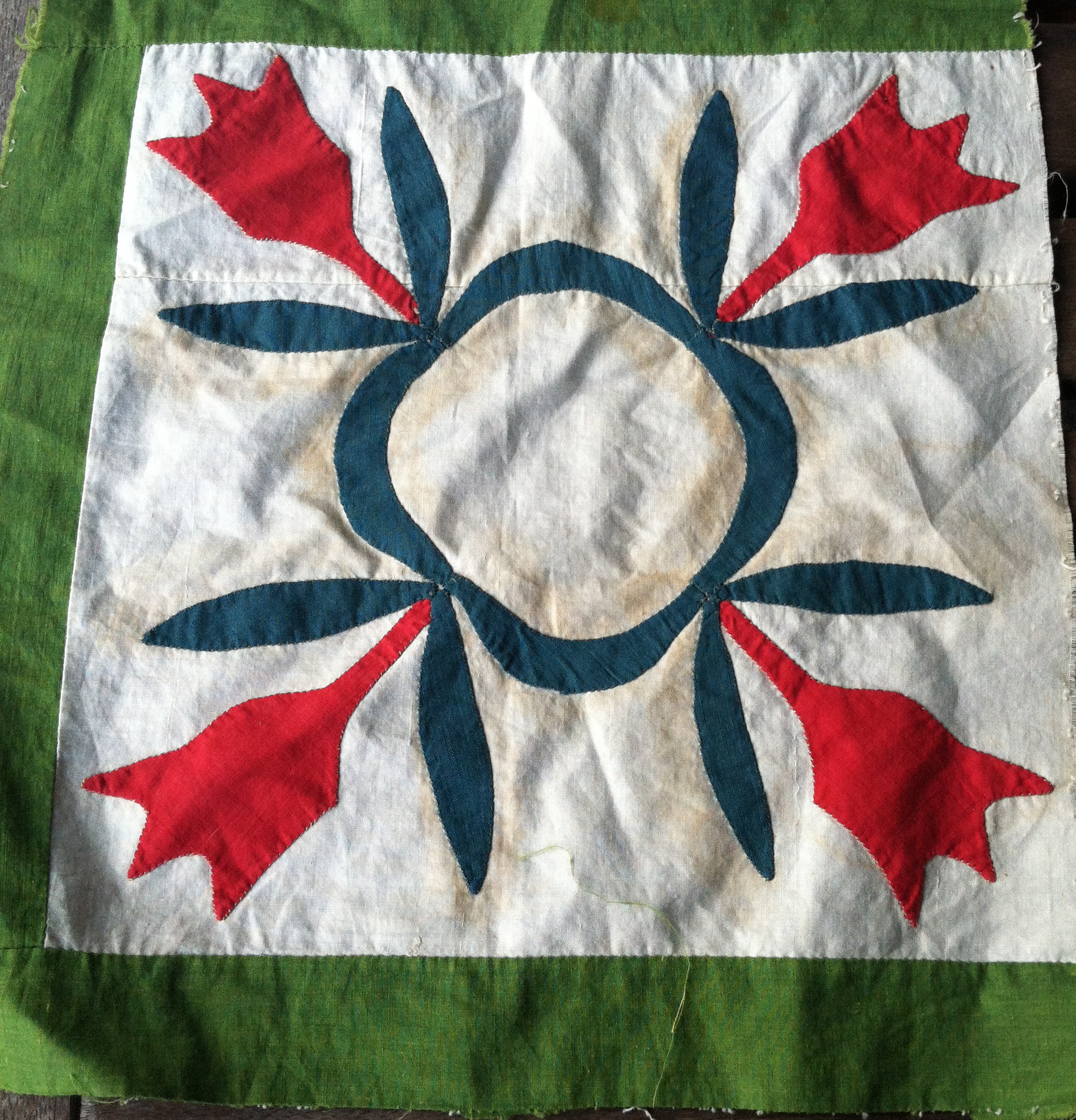
I’ve learned a lot of lessons making quilts, and I’d like to share one now. While my opinions are just that, opinions – and rather biased ones at that – I’m hoping that someone can learn from my mistakes. Or at the very least be forewarned before falling down certain rabbit holes.

I’m an avid hand quilter, and have been for over 20 years. I learned to quilt (queue blurred focus, rolling fields, and sentimental music) from Mennonite ladies in Central Pennsylvania – no kidding. They had their ways of doing things, and I quilted in a relative vacuum in my home in New York City for several years, before I realized that there were other ways.

Corner detail - basket quilt

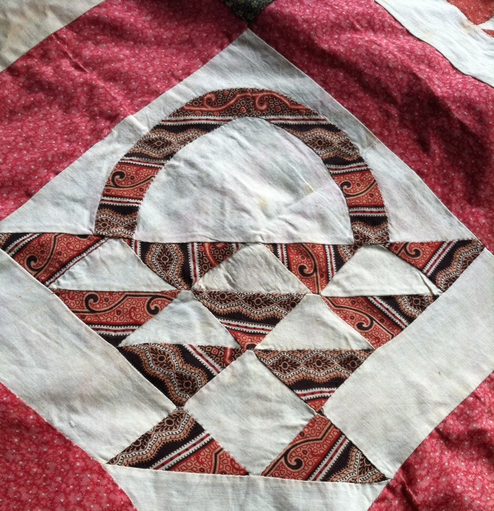
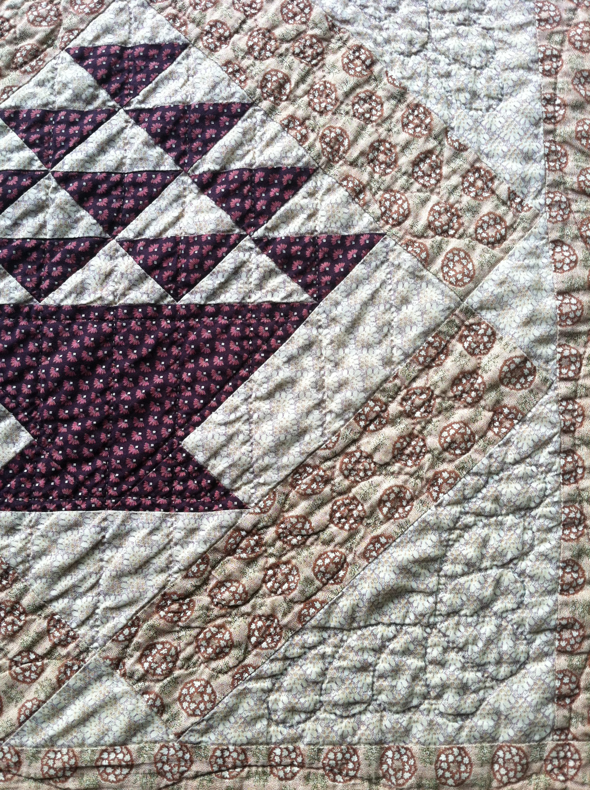
Corner detail – basket quilt

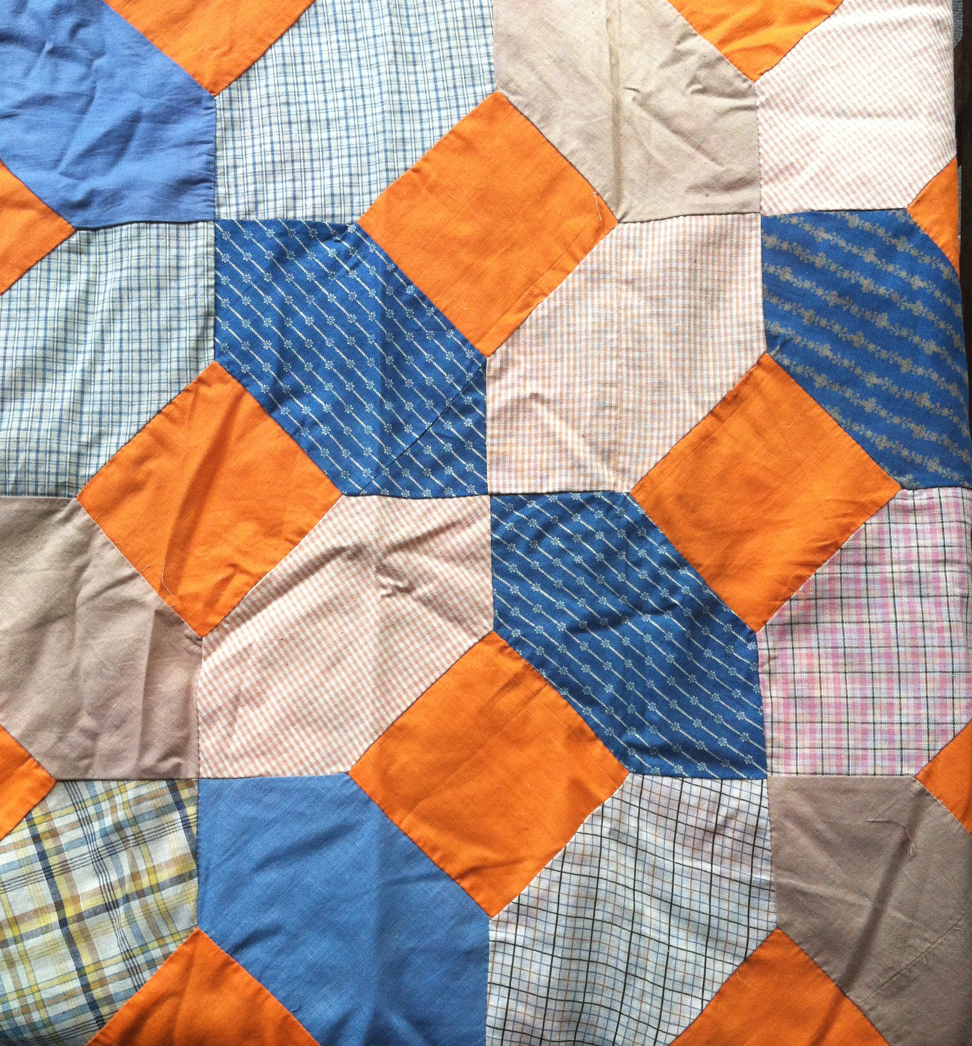
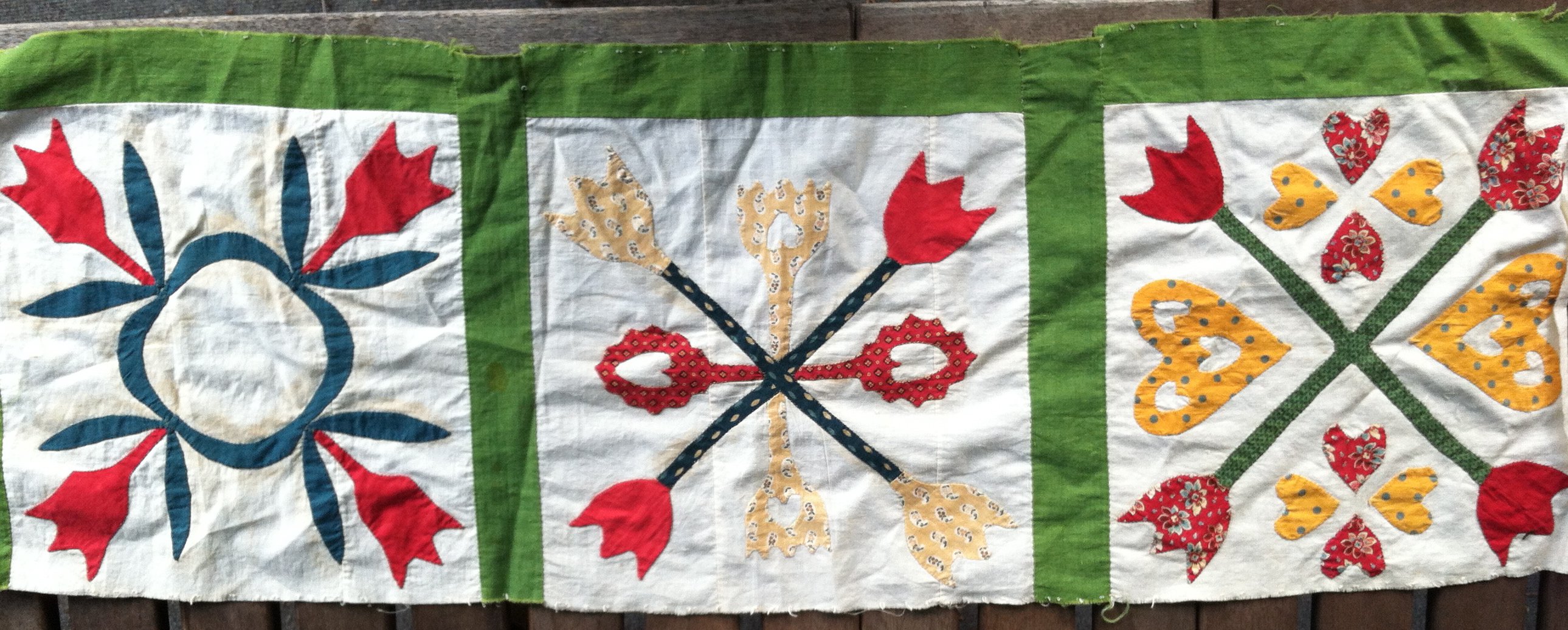
At the time I made it, this was my idea of a reproduction quilt – I used mostly (but not all) “authentic reproduction” fabrics and wanted something old-fashioned looking. To me, that meant heavily hand quilted. If you look at the corner triangle, above, there’s an elaborate feathered corner motif – a stencil was used for that. As I recall, the quilt was basted and partially marked by the Mennonite ladies who were friends of mine. When I took it home to quilt it, I did have some decisions left to make for quilting designs, and that was when I fell down a certain rabbit hole.

sashing - front side

sashing – front side

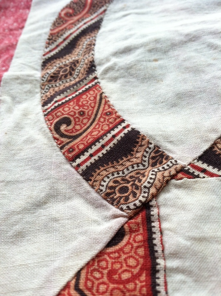
The sashing fabric, seen above, is extremely high contrast. There are black pointillist dots, white areas, dark green, medium brown, dark brown. There’s so much going on there that it became very, very difficult to find a marker that I could see, on this fabric that was used throughout the quilt.

Tip #1: Figure out when the quilting is going to count.

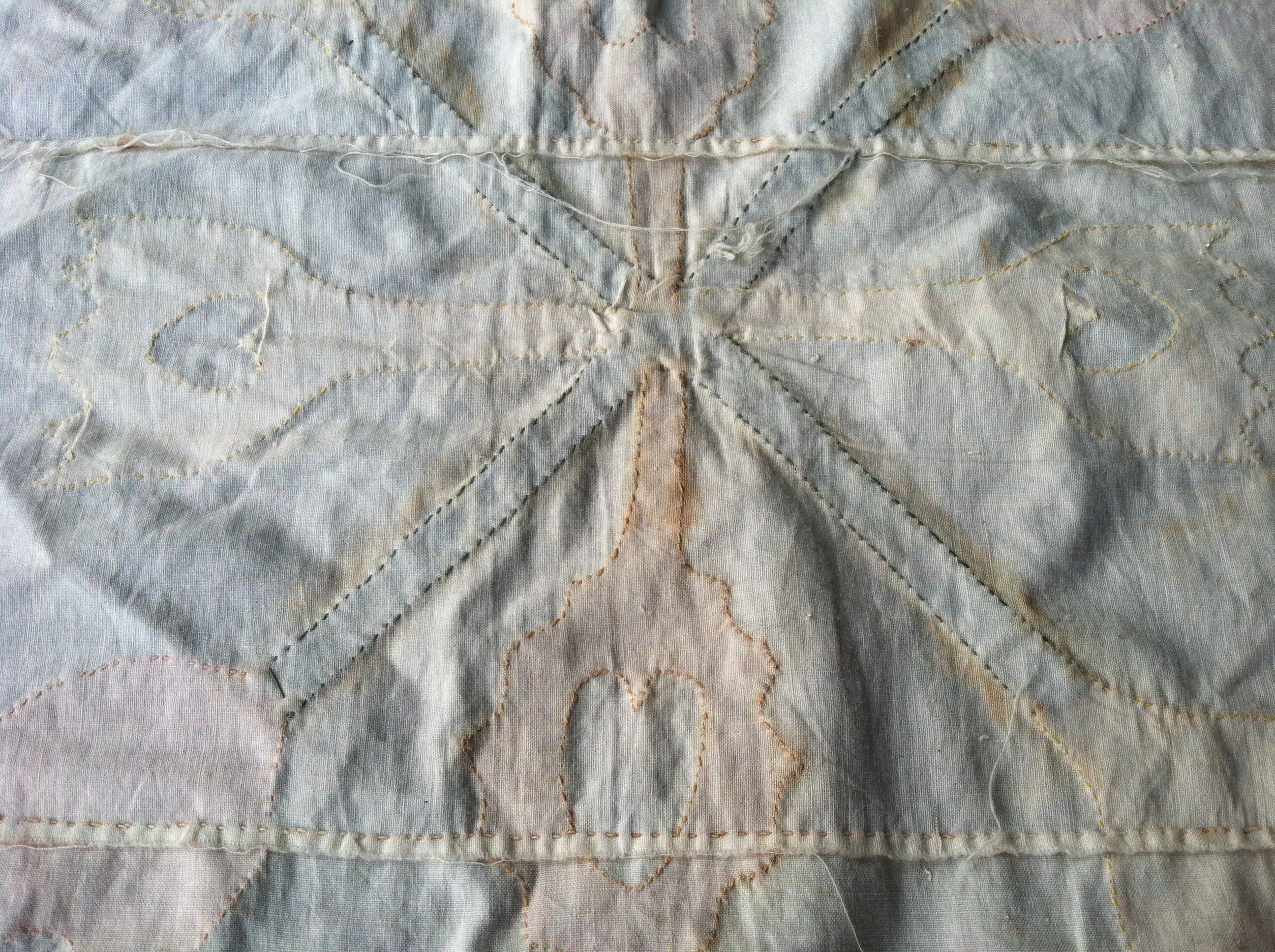
After much trial and error, I finally wound up using a permanent, acid-free fine point marker in brown for the sashing areas. You may be able to see just the faintest trace of the marks in the above picture, but you may notice that you cannot pick out the design. And trust me, there’s definitely a design in there.

sashing detail - wrong side

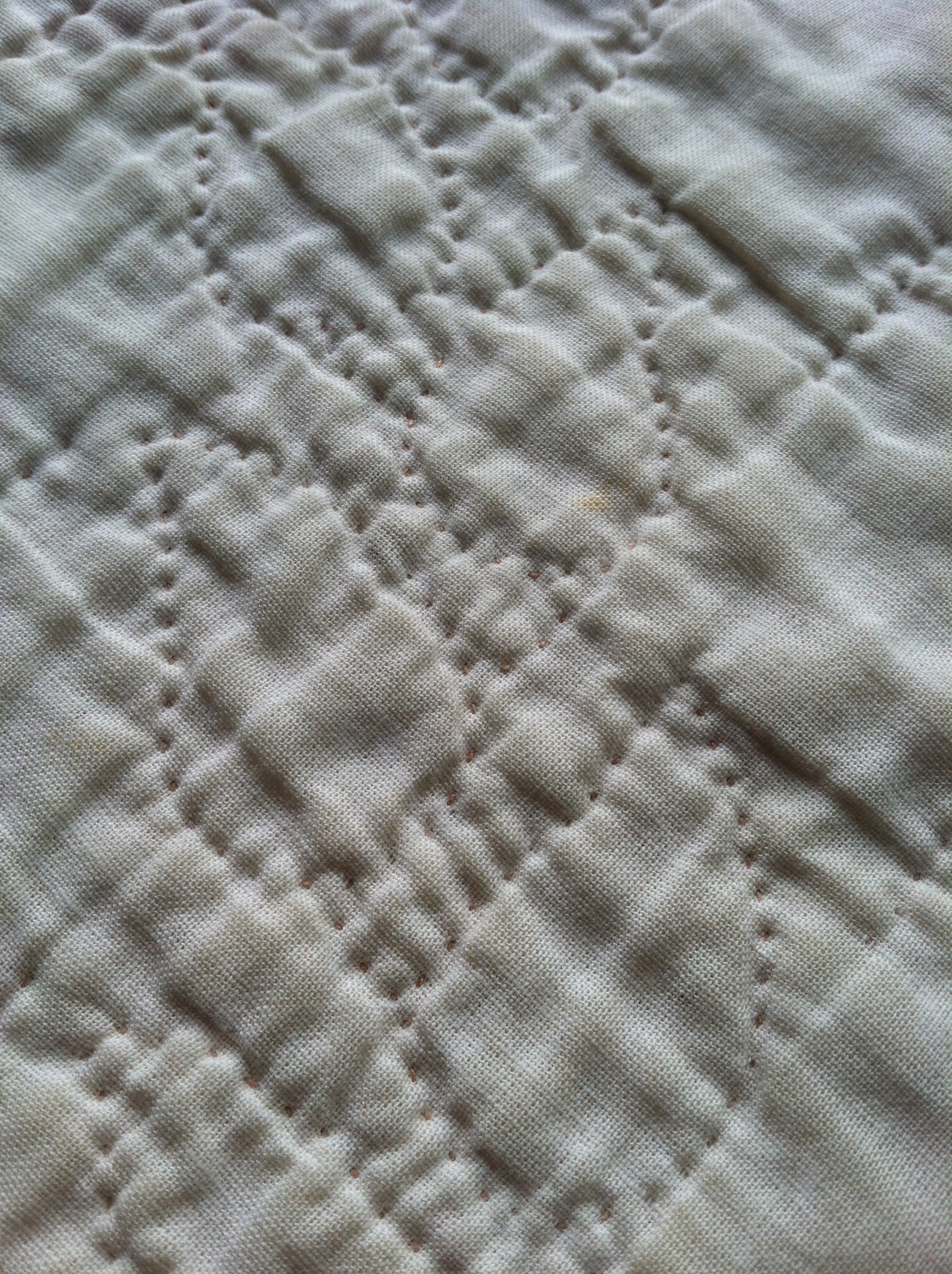
sashing detail – wrong side

Seen from the wrong side, you can catch the detail of sweet little paisley shaped leaves, climbing vine-like through the sashing. My rationale – and yes, I rationalized a whole lot on this one – was that it was “just for me” and I was going to see the quilting on the back of the quilt. Because the back of the quilt was plain white.

quilting - wrong side

quilting – wrong side

Lovely isn’t it?

Tip #2: It’s very rare that you look at the back of a quilt.

side - green block

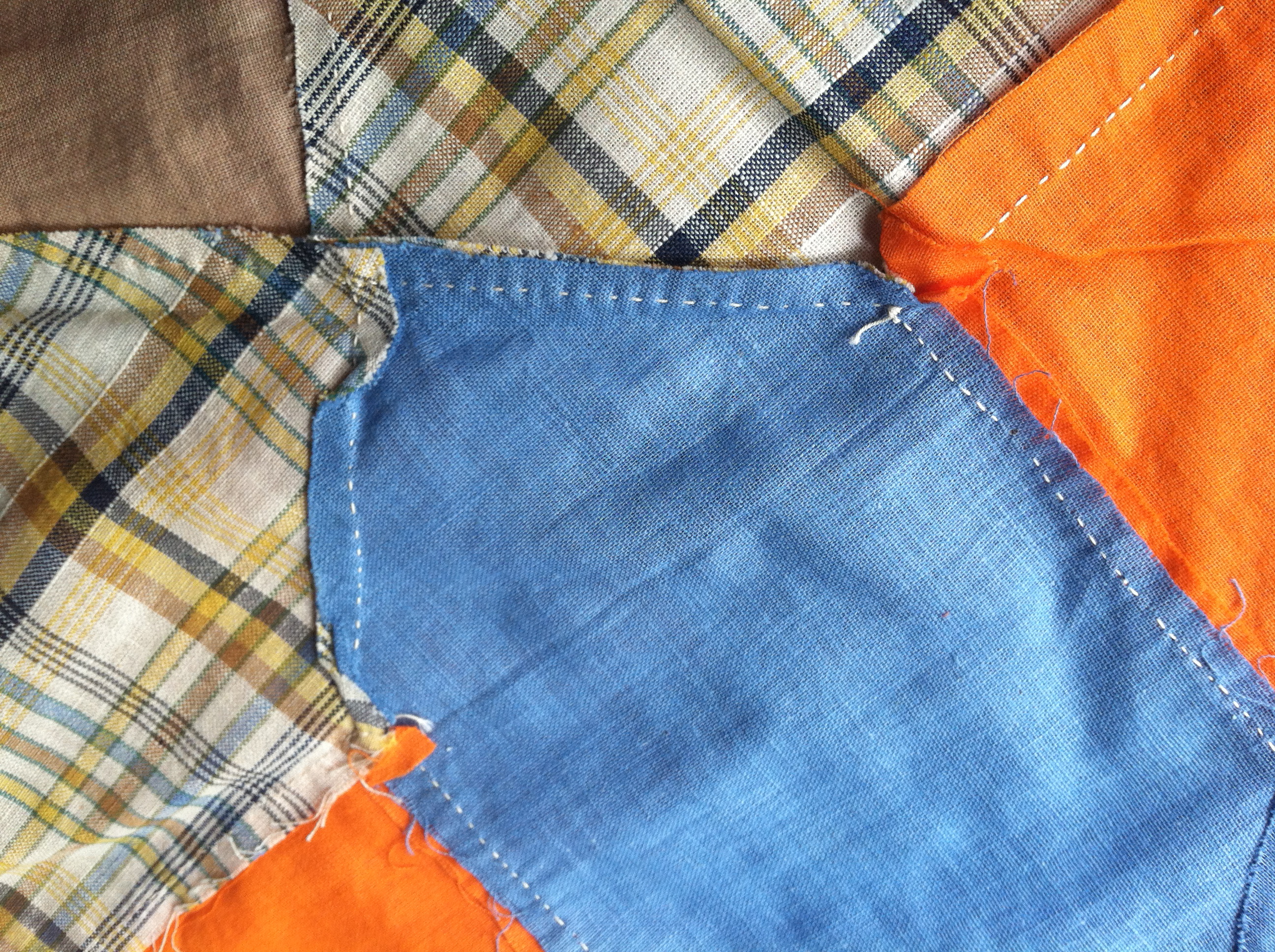
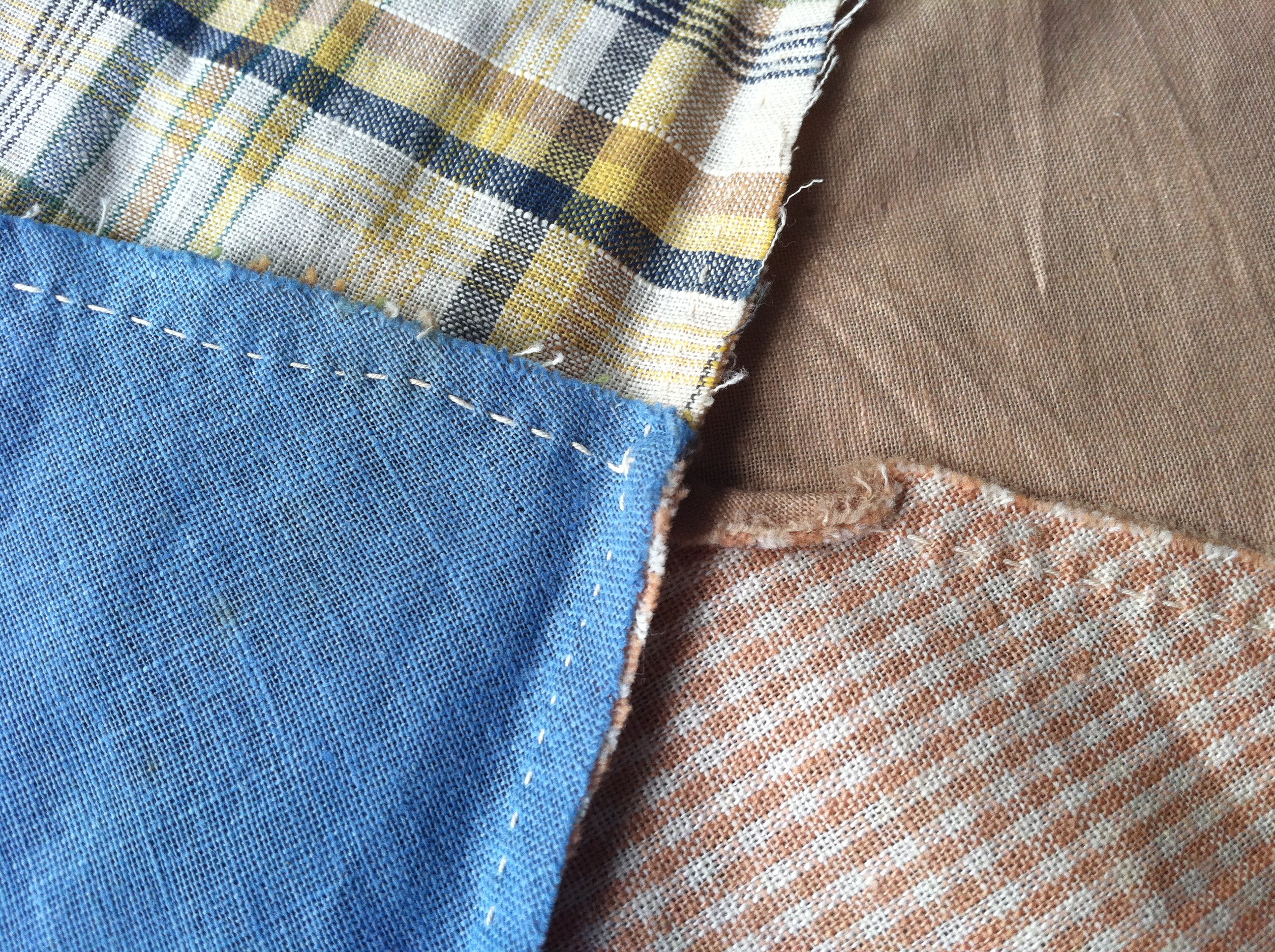
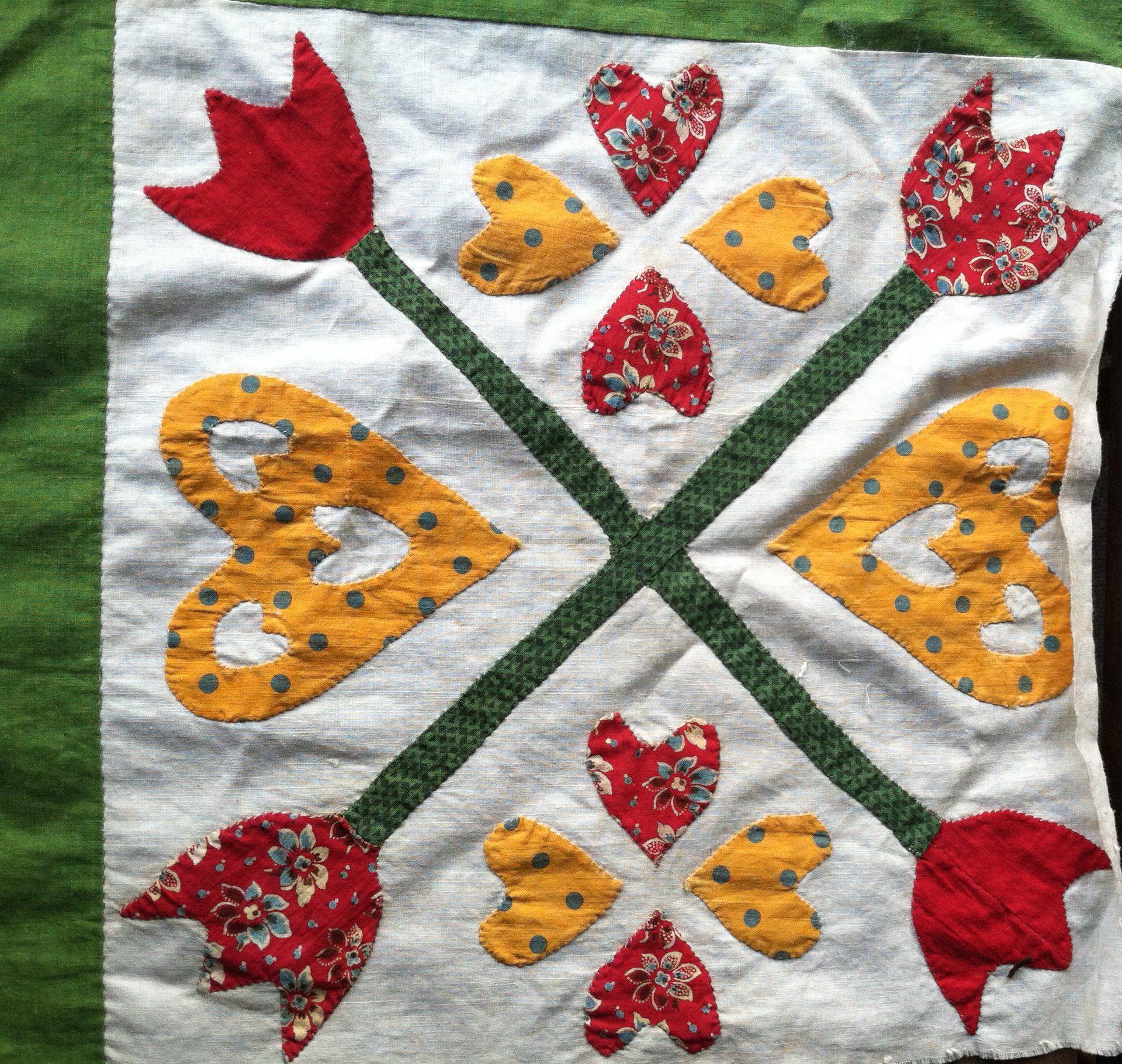
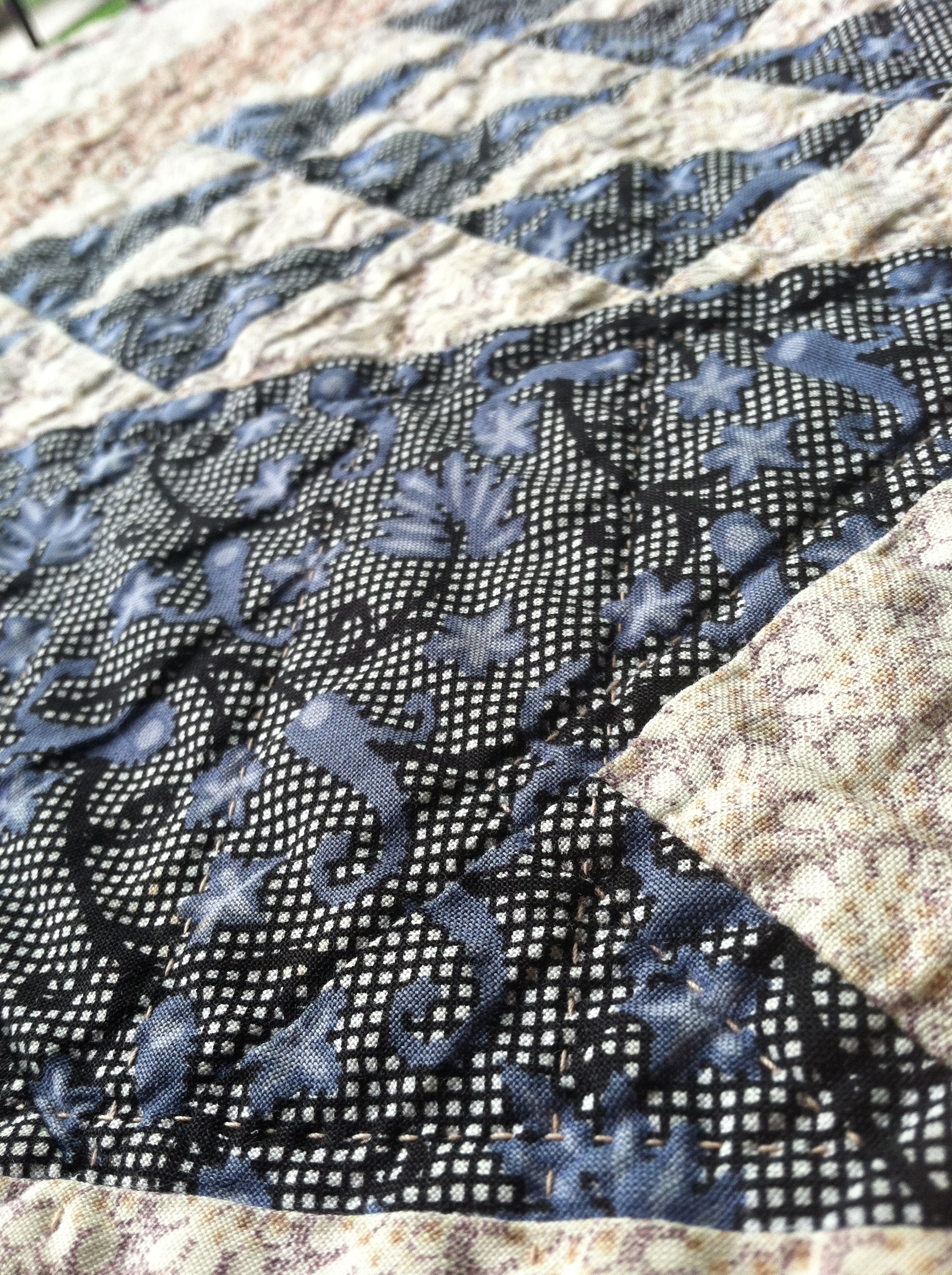
side details – front

As you can see, there’s a general … sense of quilting. Some details visible in the side triangles, and some textural effect in the sashing. But really and honestly – that’s it. Textural detail that doesn’t translate to near the amount of work I put into marking and quilting that sashing.

Tip #3: If you can’t see the marks, you won’t see the quilting.

blue basket - detail

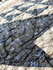
blue basket – detail

Again – high contrast black/white/periwinkle fabric. See those quilting stitches? Not much, really. They’re there, but at least in the case of the baskets themselves I stuck to simple straight lines. Easy to mark, quick to quilt.
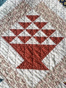
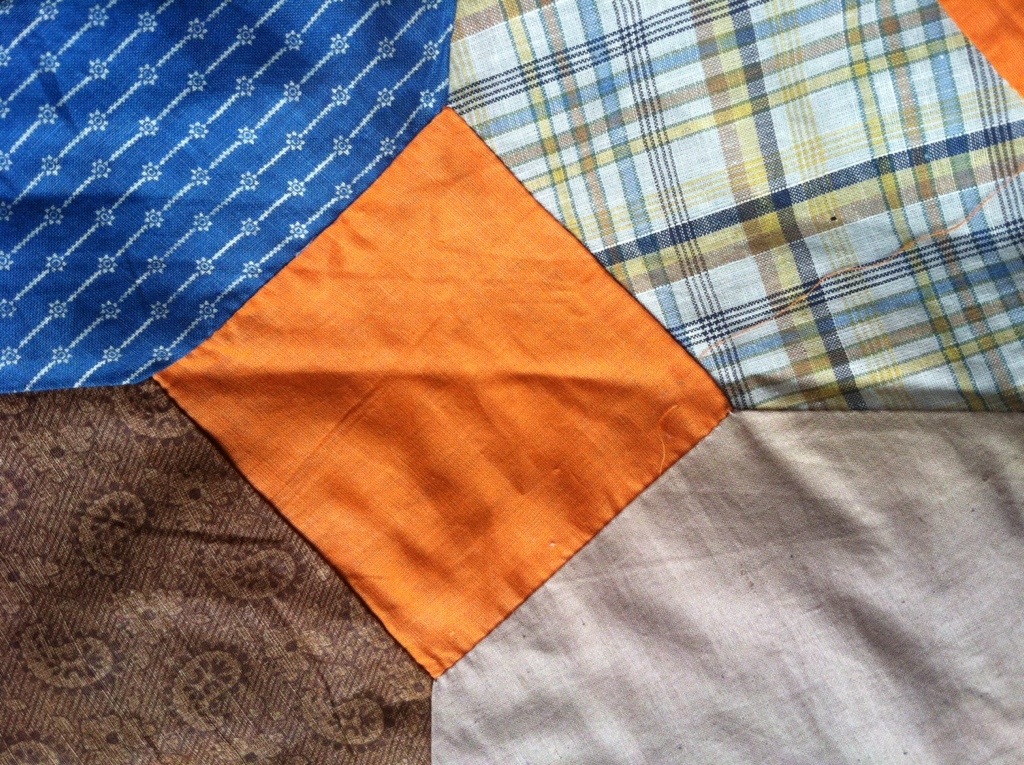
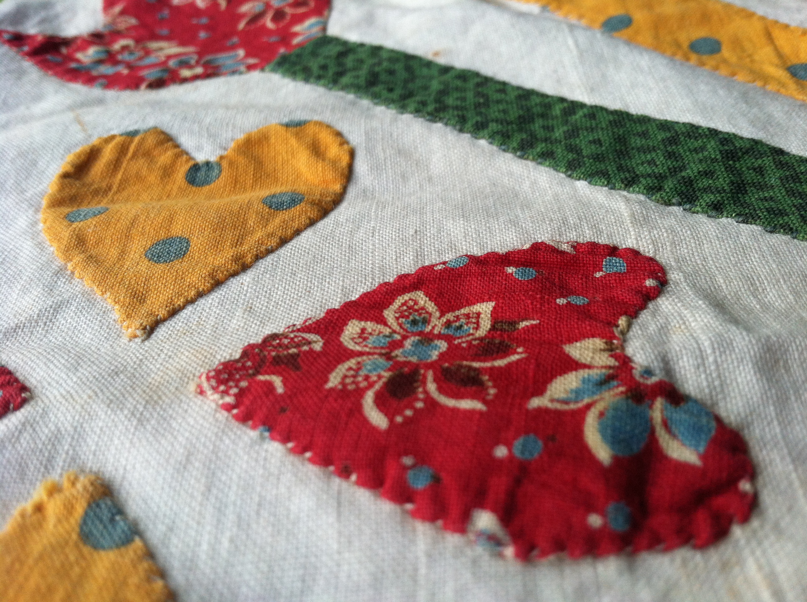
orange block

orange block

I think I’ve made my point(s). While I protested – too much – and justified my work to the nth degree, in the end what shows is basically just texture. As a hand quilter, I’m all about the texture and the detail, but I learned some really valuable lessons here about when to put the time in on something. These days I prefer to put my quilting in where it’s really going to count.